The design of your restaurant’s website plays a vital role in the customer’s overall dining experience. For many customers, your website will be their first introduction to your brand and your food. As such, it’s important to make it count. That’s why restaurant website design is so important. It’s also why we’ll be covering exactly how to create an amazing restaurant website in this post.
You’ll learn:
- What your restaurant website can achieve and why it’s important
- Which features your restaurant website needs to have
- Secret tips for creating an awesome website
- Which restaurants to copy ideas from
That’s a lot to cover so let’s get started.
Why is good restaurant website design so important?
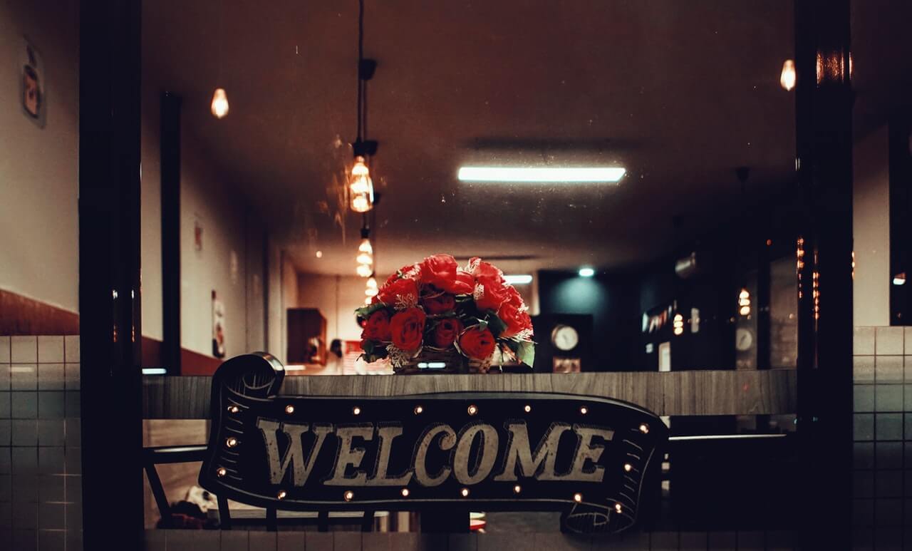
For most restaurants, their website is an afterthought. It’s something to think about once you have everything else in order first. But this is completely backward. The vast majority of restaurants could benefit from having a website in place before they’ve even opened their doors. Your restaurant’s website is crucial to the ongoing success of your business. And here’s why:
It’s the first impression many people have
Guess what; when your customers find you online, your website is the first thing they will see. It won’t be your food or the inside of your restaurant. It will be your website. So it doesn’t matter if you have the most fantastic decor or the most delicious food. If your website is ugly, they won’t pay you a visit.
You can let customers know what’s available
Sure, you want your customers to know what your current menu is so they can be tempted into coming, but it’s also important to let customers know about limited time signature dishes that are on offer. Often, these kinds of dishes can be a huge attraction and a great way to encourage repeat visits. But they only work if people know about them. Your website is the perfect way to get your message across.
It’s a key marketing tool
You may think of Instagram or Facebook first, but your website is the key to your online marketing. Why? Because unlike social media sites or Yelp, you have control over what goes on it. You control the narrative. The beauty of a website is that if you invest time into it, it will often appear higher than restaurant review websites in Google, neatly hiding that unkind review. And don’t forget that a lot of other marketing platforms will direct users back to your website too.
The features your restaurant’s website needs to have

While the design of your site will change depending on whether you’re a pizzeria or a high-end restaurant, there are some things that every restaurant website shouldn’t go without. From a menu to a booking system we list everything your website needs to have below.
Your menu clearly displayed
One of the main reasons customers will come to your website directly is to view your menu. Even those that find you through Google will want to know what’s on offer. In fact, they are probably even more likely to want to see what you serve given they know nothing about you. So give the people what they want.
Make sure your menu is clearly displayed on your site and that there is a link to it in the menu. Users shouldn’t have to go hunting all over your site to find it. They need to land on your homepage and see the link instantly. When it comes to designing the page, you don’t need to go overboard. While creating a unique design may engage visitors even more, a simple, clean layout is all that is really needed.
Booking capability
People don’t want to ring up your restaurant to book a table anymore. They want to do it without having to leave their browser. And the easier you make it for people to book a table, the more likely they’ll be to book. There are plenty of services that let restaurants manage bookings, and many come with online plugins that can integrate into your website. If in doubt, your restaurant marketing company will be able to hook you up.
Not only do you need the functionality to allow visitors to book, but you also need to display the area front and center on your homepage. Like with your menu, include a link to your booking system in the website’s menu. You could even use it as a Call To Action button throughout the entire site.
A contact form
It may seem obvious, but when all the focus is on a booking system, some restaurant owners can forget about other inquiries. Make sure you have a page that is dedicated to allowing users to get in touch. Ideally, there should be multiple methods: a phone number, a contact form, and an email address. This should also be the page where you list your opening hours and your street address.
Links to your social profiles
If you’re always posting amazing food snaps to Instagram, for God’s sake link to your account at every opportunity. There might not be any room to include them all on your website, but if you provide links to your social accounts, users can find your channel and browse them at their leisure. It’s also a good way to acquire followers and keep customers engaged. They may only visit your website once, but if you can get them to follow your social media accounts, you’ll be able to keep them updated with content every single day.
Very high quality, real-life images
Your website is a way to showcase your restaurant. That means including great images of your interior and your food. But if you’re going to include these photos, they must be professionally taken. There is a world of difference between photos taken on your iPhone and those taken by a professional. You don’t want too many large photos, however. Including loads is going to seriously slow your website down making it awful to browse on a smartphone.
5 awesome restaurant website design tips

If you include all of the features listed above, you’ll be on your way to making a good restaurant website. But you don’t want to settle for good, do you? Didn’t think so. Here are five tips you can use to make your next restaurant website awesome.
1) Make it mobile responsive
If you only follow one of these tips, make sure it is this one. Making your website mobile responsive is so, so, so important in today’s world. The chances are that if someone is searching for a restaurant near them, they are going to be using a smartphone. And if they click on your listing and your website doesn’t work perfectly on their device, they are going to leave straight away. Without a mobile responsive website, you’re potentially going to be losing a lot of business. Making it responsive also removes the need for you to pay extra for a mobile app. In effect, it’s killing two birds with one stone.
2) Keep your branding consistent
Remember, your website is the first impression a customer will have of your restaurant. So it shouldn’t just look great, it should also reflect the kind of experience you’d have. If your restaurant is a quiet, romantic setting, use reds and black. If it is a light and fresh eating space, use white and shades of green. In short, your restaurant should have some core brand colors. Make sure your website uses them as the base of its design palette.
3) Start an email list
Are you collecting your visitors’ email addresses? No? Well, you probably should. As we’ve discussed before, email is a fantastic way of building up an ongoing relationship with a customer and encouraging repeat business. Yet many restaurant websites fail to include a way for customers to sign up to a mailing list. A small button is all that is needed to start you on your email marketing journey.
4) Keep your site updated
The second worst thing you can do is to not keep your website updated once you’ve created it. If you change your opening times, change them on your website. If you change your menu, change it on your website. People will expect the information on your site to be gospel. Don’t disappoint them. Oh, and the worst thing you can do is to not create a website in the first place.
5) Understand your visitors’ behavior
Okay, this tip isn’t related to design, but it’s still important. When you build a new website, you’re going to want to sign up for Google Analytics and Google Search Console so that you can see how visitors behave on your website. We cover both of these tools in this post here, but, to put it simply, they let you see which pages people visit most, how they use your site and how long they spend on it. After a little while, you’ll be able to use this data to make decisions about your website, such as adding content to a particular page or creating new pages entirely.
Find restaurant website design inspiration
Now you know what to include on your site and how to make it as good as possible, it’s time to get those creative juices flowing. A quick Google will show you dozens of different restaurant websites, so we won’t cover them all here. Instead, we’ll look at three very different sites and understand what makes them great.
Panini Bay
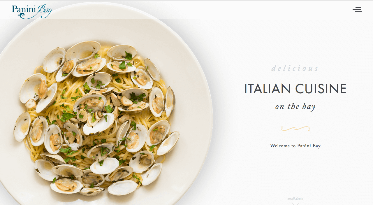
When you land on Panini Bay’s website, you immediately get an impression of the kind of fresh food that they serve. The clean, white background allows the high-quality images to pop off the screen, while also complimenting the actual design of a restaurant. The menus are easy to find and clear to read, too. The site also includes a link to Open Table where visitors can request a reservation.
Smokey Bones
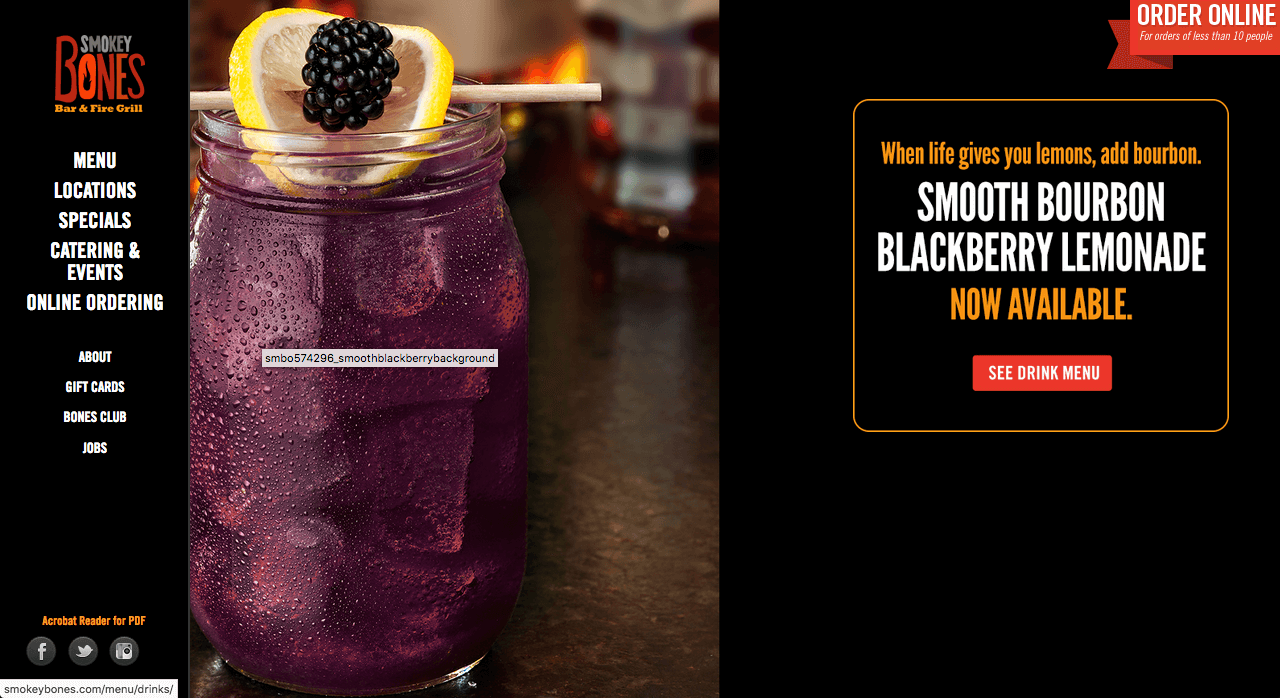
You don’t have to do fine dining to have an awesome restaurant website. Smokey Bones gives visitors everything they need, including links to the menu, restaurant locations, and online ordering all without them moving from the home screen or even scrolling. Best of all, however, is the specials that get put front and center, immediately informing visitors as to what’s on offer.
Risotteria Melotti
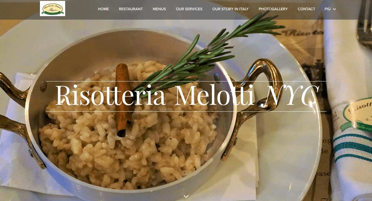
Risotteria Melotti proves that you don’t even need a great looking website to give customers everything they need. High-quality images of their food are instantly findable, as is an in-depth menu. The site even uses a popup to capture email addresses for email marketing purposes. It’s an incredibly helpful and useful site for anyone looking to visit.
Finding the right restaurant website design company for you
Let’s face it, as a restaurant owner you probably won’t be creating your website yourself. That means you’ll need to enlist the help of a restaurant website design company. We’ll save the details of how to find the perfect design company for another article, but rest assured that The Digital Restaurant have you covered. We are experts in restaurant website design and can work with you to create a great looking functional site that will attract users and convert them into customers. Find out what we can do for you by requesting a free consultation today!
Turn Restaurant Marketing Ideas
Into Predictable Growth
Successful restaurant brands don’t grow by stacking tactics.
They grow by running a connected growth system that turns visibility into orders – and first-time guests into repeat customers.
01
Diagnose visibility gaps
Identify where Google Maps, SEO, and AI search visibility are leaking demand today.
02
Fix conversion bottlenecks
Optimize website, menu, and direct ordering so web traffic actually turns into orders.
03
Scale repeat revenue
Use guest data (Email, SMS) to increase frequency, lifetime value, and predictable growth.
Built for serious operators – not one-off campaigns.
Leave a Reply